Fat letters
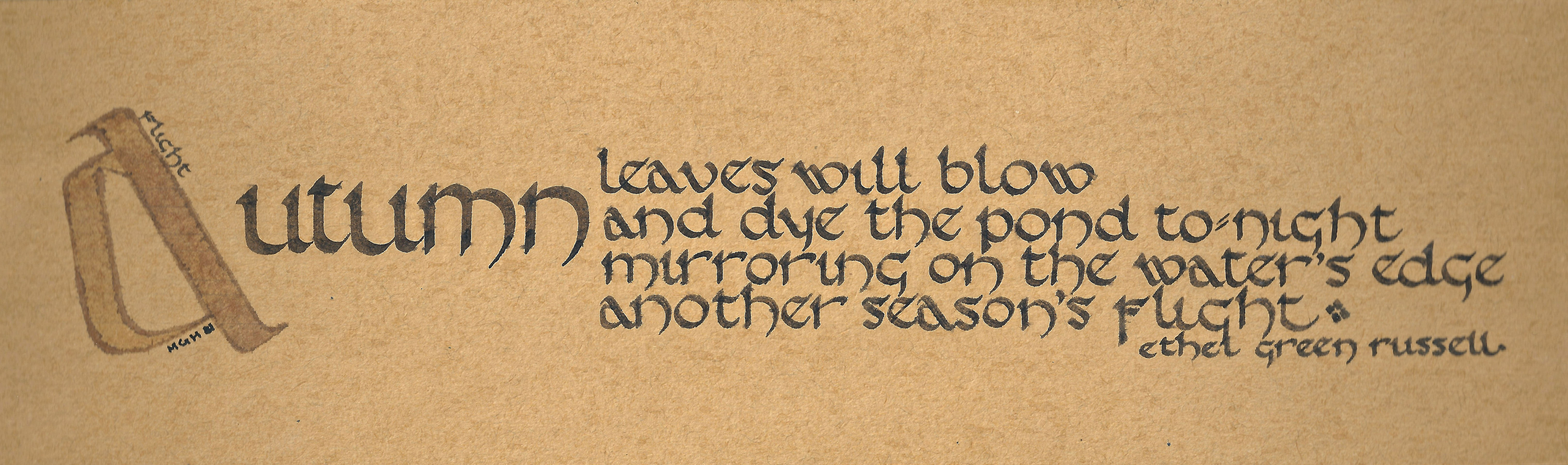
I used to be a calligrapher, and actually spent quite a bit of time studying different lettering styles. Because I also used to be a drafter (or draftsman, or draftsperson) and once had a job where we had to fill up any empty time by practicing lettering, calligraphy came pretty easy to me. There were some styles I couldn’t learn (like Copperplate), some that were too much trouble (Blackletter), and some I really did enjoy (like the sample below, of something I actually did.)
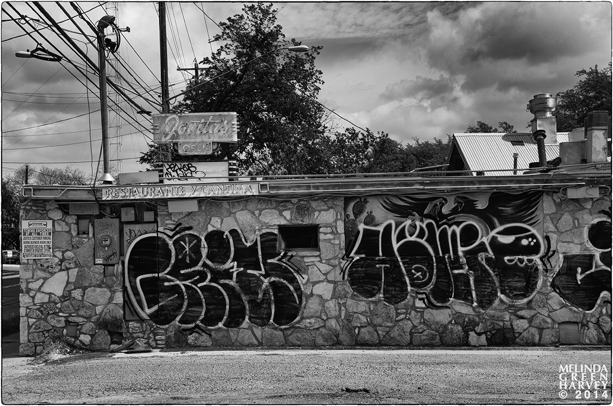
But this fat-letter style wasn’t one I learned. Which is a shame since the field of graffiti seems to have outlived the field of calligraphy.
Austin, Texas
photographed 4.12.2014
Posted on April 19, 2014, in Photography and tagged 365 photo project, alpine texas, austin texas, black and white photography, calligraphy, graffiti, melinda green harvey, monochrome, one day one image, photo a day, photography, texas. Bookmark the permalink. 6 Comments.

I see a lot of fat letter graffiti writing over here. Seems to be popular with the graffiti folk.
LikeLike
See, this is what I can’t understand – how can the graffiti-lettering styles here in Texas be the same that you see in the UK? Who decides things like that? How is the information transferred? What will be the next style? What was the last one? Where do these artists practice their techniques until they are good enough to be painted on buildings that will be seen by the general public? (There’s a very slight chance that I have a tendency to overthink things.)
LikeLike
I wonder if that restaurant serves draught beer.
LikeLike
Not any more – it’s out of business.
LikeLike
Full of draughts then?
LikeLike
That made me laugh. Out loud.
LikeLike