Marfa: the men’s cafe
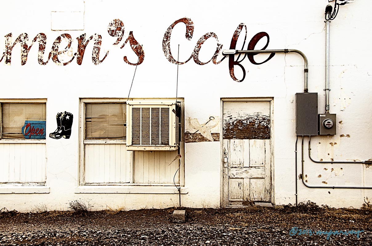
Of course this place is really called Carmen’s Cafe. But the shot was more interesting with the c-a-r gone.
It also was less interesting in black and white, more interesting in color, and most interesting in this sort of faded look.
Do you worry that I am losing my edge with the non-stop black and white? After all it was only one week ago that I posted another color shot. Both of them were taken in Marfa – maybe Marfa is making me do it….
Marfa, Texas
photographed 1.18.2013
Posted on February 17, 2013, in architecture, Photography and tagged 365 photo project, marfa, marfa texas, melinda green harvey, one day one image, photo a day, photography, texas. Bookmark the permalink. 10 Comments.

Very cool shot.
LikeLike
Thanks! Hope that seeing color on my blog wasn’t too shocking….
LikeLike
Color? Shocking (just kidding). I like the choices you made here…very interesting image. Makes me wonder what’s behind that door.
LikeLike
Thanks, Fred. I don’t know what goes on inside the place, but I can tell you that the sign beside the front door said, “Tie your horse and come in.”
LikeLike
Some shots look best in B/W others in color…. and then of course there’s no accounting for someone else’s taste!! Nice shot here, though. 😉
LikeLike
It was just too grey for my taste – you’ve probably noticed I like a lot of black in my shots. (Which I attribute to that Zone System class in college…)
Glad you like the shot. I took a LOT of pictures on that recent West Texas trip.!
LikeLike
🙂
LikeLike
I sure hope this is the alleyway or kitchen entrance to Carmen’s because if not it is the type of place that would have to have very good reputation to attract someone like me.
I like that Carmen knew how to use an apostrophe, if literacy and good cooking were reliably correlated (which I doubt) it might be enough to overcome the architectural aesthetic and get me in the door.
Colour – it suits, and occasionally you let some colour show so I am not shocked. Besides which some of your black and white shots have a lot of colour pouring out of them in an odd way – like the black skies which can be read as a beautiful deep blue. If that makes sense.
LikeLike
Yes – it is the side entrance. The front isn’t that much different, though, and I am not even certain if the place is still in business.
And I agree – kudos to Carmen and/or her sign painter for proper apostrophe usage. The correlation between good apostrophes and good food is probably non-existent, but maybe I could find a grant to fund a comprehensive Canada-US study. Then we’d know for sure!
“Some of your black and white shots have a lot of colour pouring out of them” is a very nice compliment, and I appreciate it.
LikeLike
Pingback: White on white, 3 | One Day | One Image