My dilemma
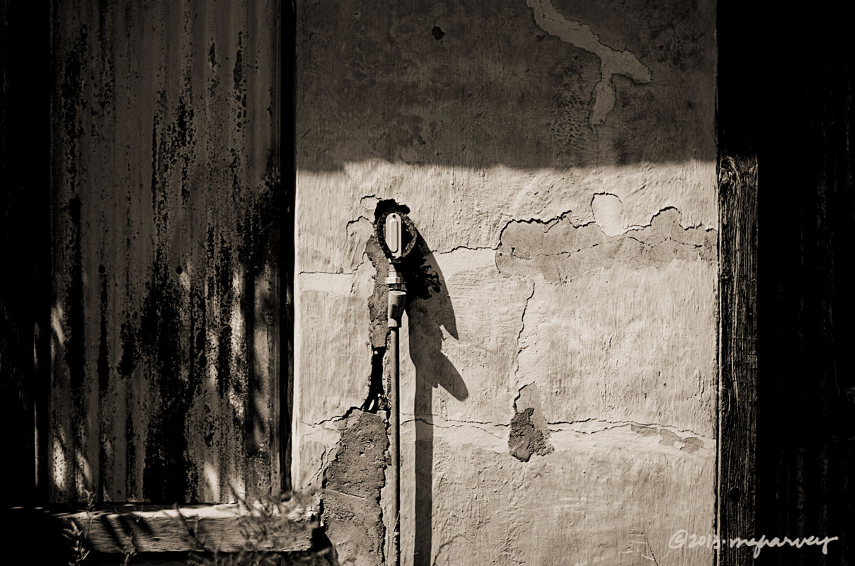
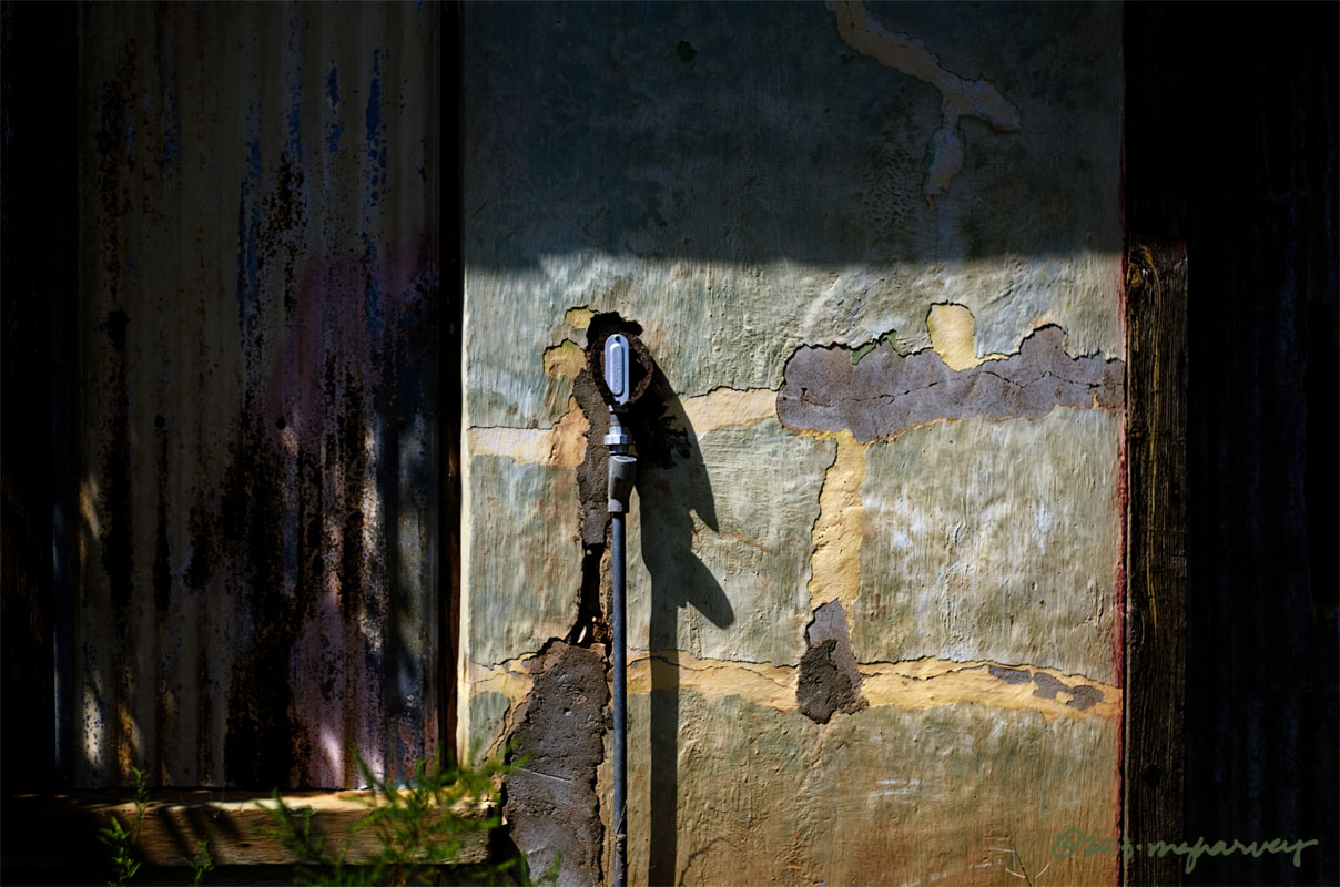
Usually, I don’t even think about it – I just know that whatever I am posting is going to be in black and white. Every now and then, though, a photo will demand to be in color, so that’s the way I post it.
This one, though, has been difficult to reason with. It wants it both ways, and honestly, I see its point. The color one is nice, with the lavender and cream and green and blue. But the other one’s got texture everywhere. I can’t decide.
Opinions/comments/votes are welcome.
Puerto de Luna, New Mexico
photographed 9.21.2013
Posted on October 1, 2013, in architecture, Photography and tagged 365 photo project, abandoned buildings, architecture, melinda green harvey, new mexico, one day one image, photo a day, photography, puerto de luna, puerto de luna new mexico. Bookmark the permalink. 22 Comments.

The sepia photo does show the texture a little better than the color but it lacks the visual “punch” of the color version. Emo does not agree because his color perception leaves something to be desired. Put me down for the color version and Emo will vote when he wakes up.
LikeLike
Thanks for the vote – but I am a little worried that when Emo casts his vote, it will cancel yours. Risks of a democracy, I suppose.
LikeLike
When I saw the first one, I thought, that’s it. But wow, the color one is great. Glad it’s not my dilemma!
I like that you are being challenged on cropping and on color – makes life so interesting! What’s next?
LikeLike
Color? Cropping? I don’t even KNOW what could happen next!!
LikeLike
Color!
LikeLike
Thanks, Victor. The votes seem to be leaning toward the color version.
LikeLike
In this case, the colour version has more punch, and I prefer the darker shadows in this one as well.
LikeLike
Thanks – I was surprised by how much I liked the color version. I am very fond of that lavender color right in the center….
LikeLike
I love the 2 versions… but prefer, in this case, the colour version… more “texture”, like the first comment. 🙂
LikeLike
Thanks – the color version seems to be the more popular one.
LikeLike
IMO this time color wins over texture.
LikeLike
Thanks, Vera – color seems to be more popular on this shot.
LikeLike
Yep, colour for sure, although I do like them both together like that as a contrast 🙂
LikeLike
I think seeing both versions does enhance the color one.
LikeLike
I say don’t choose. Love them both.
LikeLike
See? That was my dilemma when I was working on the blog post!
LikeLike
Colour for me too, though the corrugated iron is better in the mono version. It is the unexpected pastels that make this shot so interesting for me.
LikeLike
Yes – the unexpected pastels were what I liked, too.
LikeLike
I really lke the color version. It’s the variations of color in the wall that does it for me.
LikeLike
Thanks, Edith.
LikeLike
The subtle colors in that light are gorgeous. It gives a lovely sense of warmth.
Having said that, I could see these framed up together and it would be beautiful art.
LikeLike
Thanks, Karen.
The landscape in that town is harsh, but there were some trees near this place that filtered the light a bit, which makes such a difference in the way it looks.
LikeLike