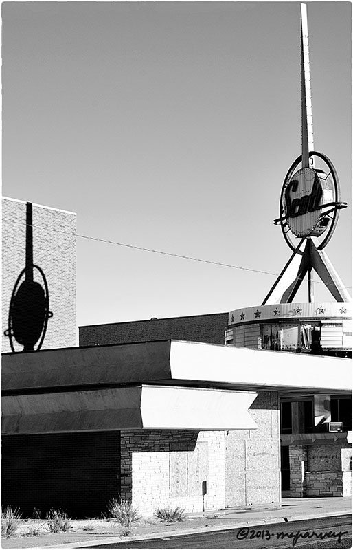
At the theater
The sign alone would have been worth a photograph. Add in the shadow…and I had to stop.
Turns out that the sign, for the Scott Theater (which opened in 1959), was a revolving marquee fashioned after signs at the New York World’s Fair. The sign weighed 5 tons, and was said to have cost $35,000. It was also said to be able to withstand winds of 130 miles per hour. Mr. Bill Martin, whose company designed and built the sign, said it was “the ultimate design for the future of all marquees.”
The theater closed in the late 1980s. And the sign hasn’t blow down yet.
Odessa, Texas
photographed 12.8.2013
Posted on December 17, 2013, in architecture, Photography and tagged 365 photo project, abandoned buildings, architecture, black and white photography, downtown, melinda green harvey, monochrome, odessa, odessa texas, one day one image, photo a day, photography, scott theater, texas. Bookmark the permalink. 11 Comments.

And it’s still a beautiful sign! Actually, it’s more of an architectural detail and it’s worth saving, It’s a great piece of mid-century signs.
LikeLike
I wish I could have seen this sign when it was lit, and rotating!
Coming up Sunday is another fantastic sign I saw in the same town; evidently Odessa is a hotbed of signage. Who knew?
LikeLike
Great round shapes and white rectangles in this photo contrasted by the grey bands and the black blind space below.
LikeLike
Thanks, Vera. I spotted this from a couple of blocks away – it’s sort of hard to miss! – and it made the trip to Odessa worth it!
LikeLike
Strikes me that there is a shortage of rectangles in Odessa. I wonder what brought you there in the first place…
I agree with Ken – this should be preserved, and restored. It is a great bit sign, in fact, it is a sign of its times.
LikeLike
I had a reason to go, but now that I know the rectangle situation, it’s hard to imagine that I’ll ever go back!
But this sign is quite fantastic! I was happy to find it! And it was even worth slipping, and falling, on icy stairs to get the shot. (No cameras were harmed.)
LikeLike
Yikes. Glad to hear about the camera. But really, you need to remember your crampons when you go out photographing. Good for ice, and as a deterrent to alley dwellers that might want your camera, but are not interested in paying.
LikeLike
Alos, wearing crampons would give me some additional height – enough, perhaps that I would not even need to try icy stairs.
LikeLike
That sign makes me think of hypodermics, so it is not the most comfortable image.
On a more critical note, I think I want a touch more sky above that point, it feels crowded somehow – like it is going to jab through the frame in an unwanted way.
LikeLike
I agree with your comment re. the sky. I had to straighten this quite a bit – I was hunkered down on that infamous stairway to take this and it had an unsatisfactory tilt – and I ran out of sky. I think I know how to add more sky, by expanding the canvas and cloning it in. We’d both be happier if I did that I think!
LikeLike
Pingback: Headquarters | One Day | One Image