Farnsworth’s Bedroom
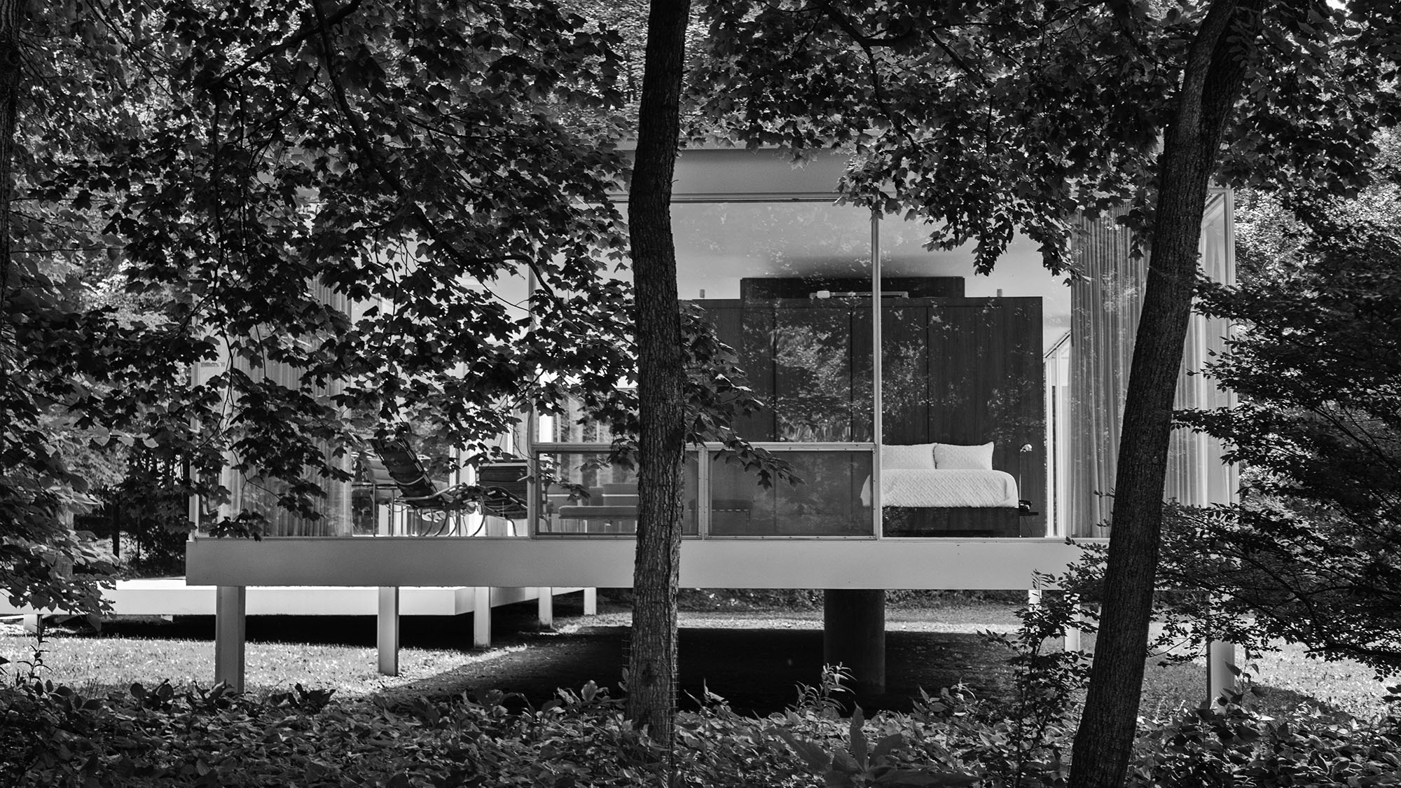
This place is famous. Architect Mies van der Rohe designed it for his client, Dr. Edith Farnsworth, as her weekend retreat; it was designed and constructed between 1954 and 1951.
Or, evidently, he designed it without really listening to what she wanted, and the two of them were bitter enemies before it was all over. Writing about the conflict in 1998, author Alice T. Friedman asserted that “[t]here is no evidence to suggest that [Farnsworth] sought to have her behavior challenged by the ‘inner logic’ of Mies’s unyielding architectural vision; on the contrary, she seems to have had a clear idea about how she wanted to live and she expected the architect to respect her views… [S]he soon discovered that what Mies wanted, and what he had thought he had found in her, was a patron who would put her budget and her needs aside in favor of his own goals and dreams as an architect.”
There were (and still are) problems with it. It’s all glass, so it’s hot in the summer, cold in the winter; the original house didn’t even have an air conditioner and didn’t have adequate natural ventilation. At night, the lights from inside the house drew in insects. It floods, a lot. (In fact, when we were there, it had just reopened after high water from the nearby river made it inaccessible.) In 1996 water rose to five feet inside, high enough to float a Warhol portrait of Liz Taylor off the wall down the river; it was seen again.
And the cost? She’d intended to spend between $8,000 and $10,000 but the final cost was somewhere around $74,000. “My house is a monument to Mies van der Rohe, and I’m paying for it," Dr. Farnsworth reportedly told her nephew.
Farnsworth House
Plano, Illinois
photographed 6.24.2018
Posted on September 9, 2020, in Photography and tagged 365 photo project, architecture, black and white photography, learning to see, Leica, melinda green harvey, monochrome, one day one image, photo a day, photography, postaday, take time to look, thoughtful seeing, travel photography. Bookmark the permalink. 8 Comments.

Somewhat parallel story: I was speaking with a designer friend several weeks ago about user interface and user experience design. I made the comment that the first criterion for a great design is that the thing has to work. And it has to be something that somebody wants.
LikeLike
It’s sort of a shame how often neither of those two criterion are met, isn’t it?
LikeLike
PS: I’m talking to you, Jony Ive.
LikeLike
Yes, she agreed, as she typed on her beautiful wireless Apple keyboard, a device which puts all other keyboards to shame.
LikeLiked by 1 person
Interesting. I just replaced mine with a $39.95 keyboard that to me as much more comfortable keys to type on. Recognize that I have been a Macintosh user since February 1984, less than a month after it was introduced. I’ve seen every single aspect of hardware and software design. Jony made things astonishingly beautiful in his minimalistic way (and you know how I feel about minimalism) but in terms of actual functionality, not so much. After he left, Apple came out with the current 16-inch MacBook Pro. It actually has keys you can type on. I sold my one-year-old 15-inch MBP to my sister-in-law and got the 16-inch one. Thing is, I like keys that have a bit of travel. But different people have different tastes.
LikeLike
Nope – I’m more of a stay-at-home person when it comes to keys. (I had a keyboard at work that felt like every time I hit I key I was wrist-deep in the device. I didn’t have it very long…;)
LikeLiked by 1 person
There’s a happy medium. In my opinion. This is the opinion of the current writer and does not necessarily reflect the the opinion of the management.
LikeLike
Yikes
LikeLiked by 1 person